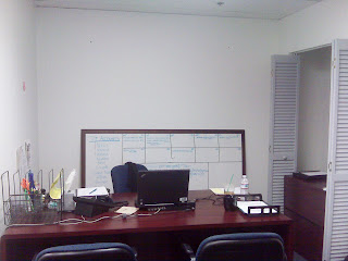
Her design dilemma? How to turn her dreary office space into a cool upbeat space that inspires her.
Office spaces are always a tricky design path to navigate because:
- You usually can't do anything real dramatic like paint
- You have to keep it gender-neutral, and your finished product still has to reflect your maturity and competency...(aka no sorority pics on the wall, or butterfly photos). You and your space need to be taken seriously.
- Most of your design updates will usually come out of your pocket, so it has to be affordable
WARNING: These photos are not to be viewed by those who are sick or easily get sick. Bad design can increase the risk of the blues and overall gloominess. This risk is higher for people who believe in good design. If you can not take bad design, do not stare directly at the following photos...
AREA #1:
What if you moved the filing cabinet that is in the closet over to the other side of your desk up against the wall? Then you could move all of your desk accessories on top of the filing cabinet and away from your direct work space.
Create a serene and creative desk top by only keeping the bare necessities: laptop, phone, small cup holder with pens...everything else can go to the side.
I'd then add a table (not desk) lamp to both your and your office mates desks. Table lamps give off much softer and relaxing light rather than a harsh desk light.
 | |
| Walmart |
I'd also include a colorful vase with fresh flowers.
 |
| Ikea |
For only $35 each you can replace your guest chairs with some fun modern chairs like these from Ikea:
 |
| Ikea |
If you do have to keep some papers on your desk...try to hide them from view with these:
 |
| Ikea |
AREA #2:
First, I would add some personal art to the empty wall. I love this modern painting of DC from artist Bombay:
Since you can't paint the bookcase, I would cut either craft paper, or wallpaper in a solid color or cool design, and with double sided tape, adhere the paper to the back of each shelf. This will give a non-permanent design element and really brighten the cabinet.
Once you have freshened up the cabinet, I would fill it with books :) Cabinets look so sad empty. I would use these great boxes to fill up space:
 |
| Ikea |
 |
| Ikea |
 |
| CB2 |
AREA #3
Sometimes it's hard to fill up an empty wall this large. I recommend either a large wall covering like this:
 |
| CB2 |
Or a series of framed poster art like this:
 |
| Ikea |
 |
| Ikea |
 |
| Ikea |
AREA #4
I would turn this great "nook" into a refreshment area with the following:
An inexpensive colorful side table
 |
| Ikea |
And a floating shelf above the mini bar for glasses
 |
| Ikea |
 |
| CB2 |
Here are some additional items if you have the space:
 |
| CB2 |
 |
| Ikea |
 |
| Ikea |
 |
| JcPenney |
 |
| Ikea |
 |
| CB2 |
Do you have a design dilemma? Email me with pics!


No comments:
Post a Comment